
Hi everyone, welcome to my website. In this short tutorial, I'll show you how to create an animated gradient with CSS for background. If you want just copy and paste necessary code, you can do it directly from this website, or go to CodePen that I created, and copy, update or play with code.
Creating an animated gradient with CSS
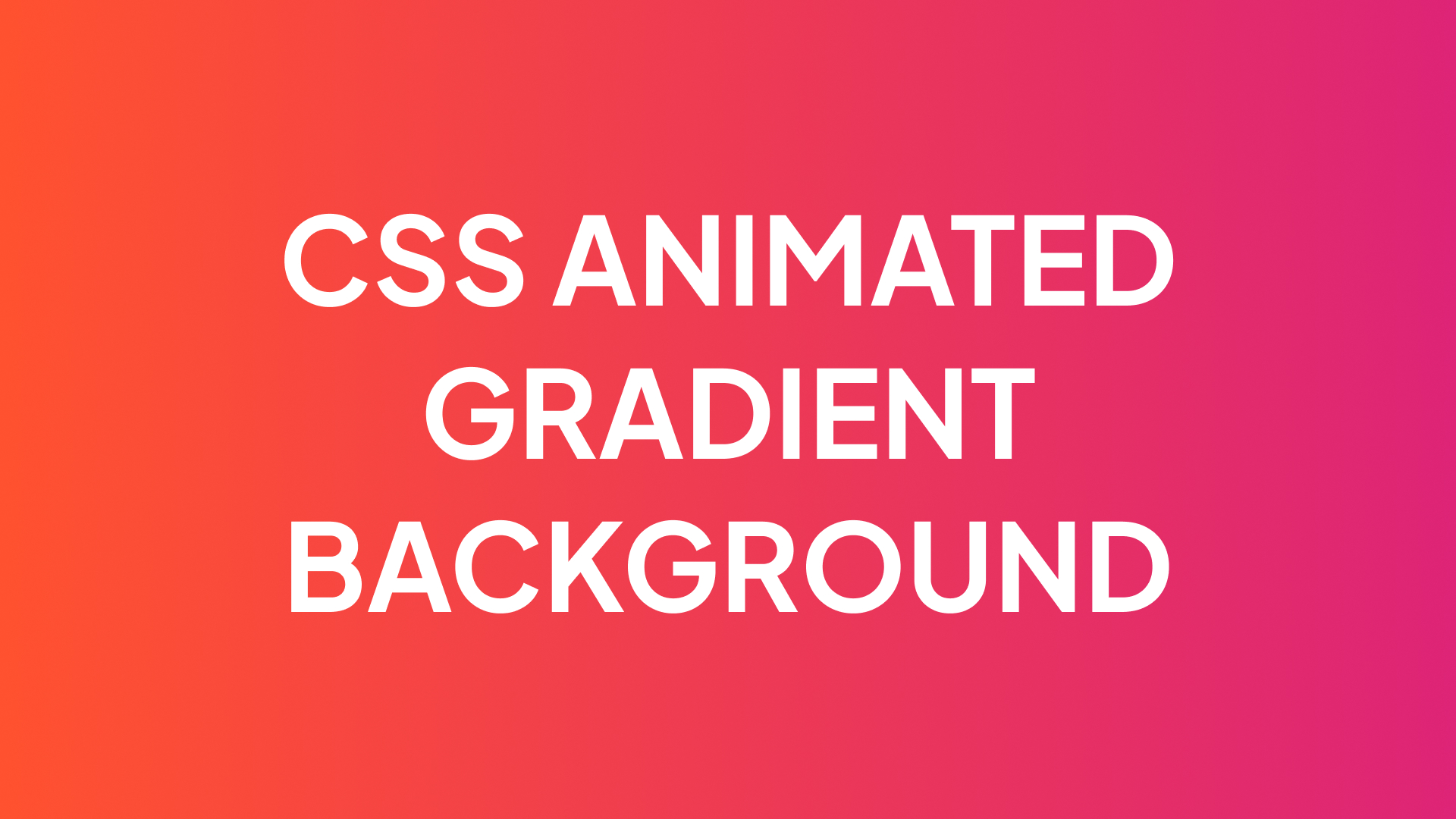
Firstly, let's create an HTML element that will have an animated CSS gradient in the future. I'll create a div tag with 'gradient' class, but you can apply this technique for any element on your website.
<div class="gradient"></div>Now let's deal with CSS part. The main idea behind this way of creating animated CSS gradient, is to create a bigger background than the element is. In my case, gradient will have a size of 400% of element. And then we will add animation, that will be moving this gradient through the element. Because of this moving, we will achieve gradient animation.
.gradient {
    height: 450px; /* Here you can use any size for element */
    width: 100%; /* Here you can use any size for element */
    background: linear-gradient(45deg, #FF512F 0%, #DD2476 100%);
    animation: gradient 2s infinite linear; /* 2s - speed of animation */
    background-size: 400%; /* You can play with this value to change intensity of the effect */
}

@keyframes gradient {
    0% {
        background-position: 80% 0%;
    }
    50% {
        background-position: 20% 100%;
    }
    100% {
        background-position: 80% 0%;
    }
}
CSS code for animated gradient is very simple. The main difficulty for me personally, is to create nice looking gradient, pick right colors to make it looks fine. But you can make your life easier using CSS gradients generator, such as this one.
Thanks for reading! Hope this tutorial was helpful for you.