
Hello everyone, welcome to my website. In this quick tutorial, I'll show you how to create CSS pulse animation for any element on your website. If you want just copy and paste necessary code, you can do it directly from this website, or go to codepen that I created, and copy, update or play with code.
Creating CSS pulse effect
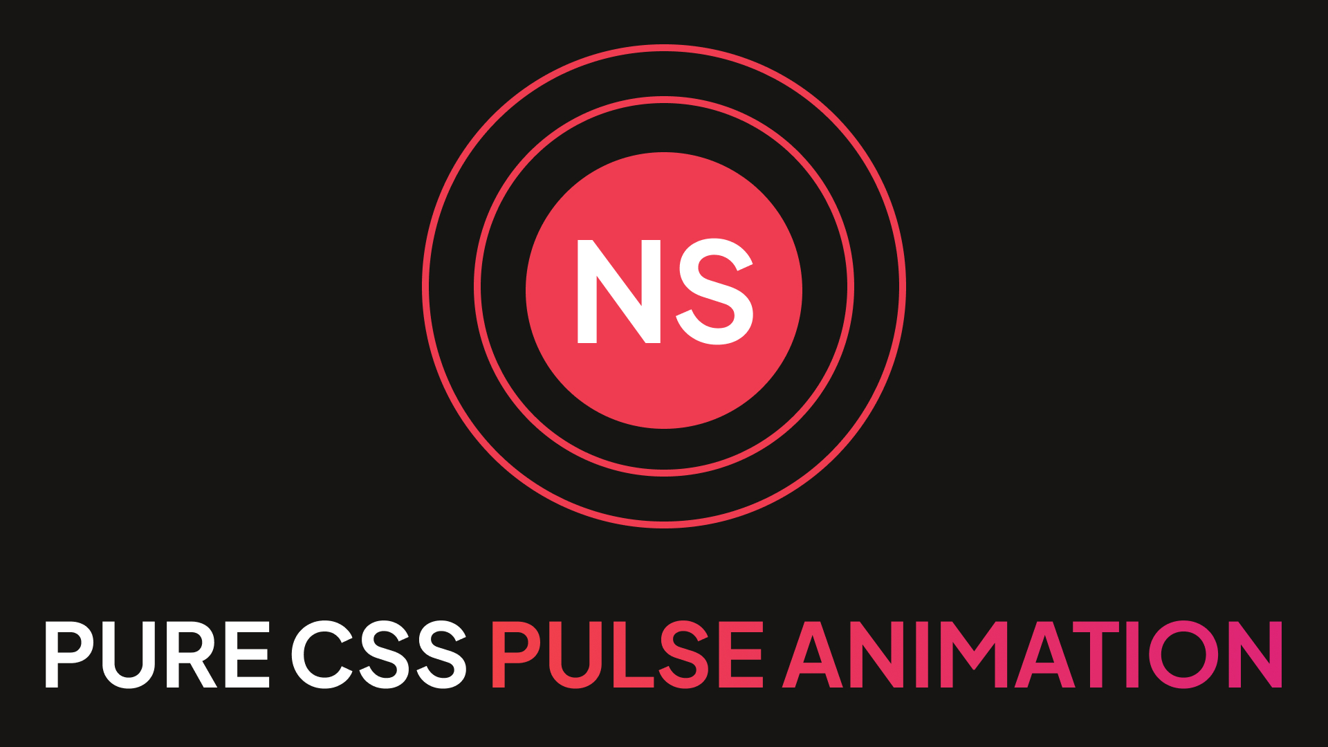
First thing first, let's create a simple HTML layout. All we need to do, is to create a wrapper around the element we want to add pulse animation. In my example, I'll add animation just for the image with my logo, so I'll wrap the image with <div>. But you can make wrapper with <a> or <button> to add pulse animation for interactive elements.
<div class="pulse">
  <img class="pulse__image" src="https://nazarii-semeniuk.com/images/logo.jpg" alt="Logo" />
</div>
Next, let's add some basic CSS styles just to style the image.
.pulse {
  position: relative; /* Will be needed in the future for animation */
  text-align: center;
  padding: 20px;
  border-radius: 50%;
  background: #EF3C50;
  width: 80px;
  height: 80px;
}
Next, we will style ::before pseudo-element. This element will be animated. Basically, this element will be our "effect". During animation, we will simply change it's size and opacity.
.pulse::before {
  content: ''; /* We need this to display pseudo-element */
  position: absolute;
  border: 2px solid #EF3C50;
  opacity: 0;
  left: -20px;
  right: -20px;
  top: -20px;
  bottom: -20px;
  border-radius: 50%;
  animation: pulse 2.5s linear infinite;
}

@keyframes pulse {
  0% {
    transform: scale(0.5);
    opacity: 0;
  }
  50% {
    opacity: 1;
  }
  100% {
    transform: scale(1.2);
    opacity: 0;
  }
}
That's all. If you run this code right now, you will see the animation but only with one animating element. Let's make animation looks better.
CSS pulse animation: final code
To make animation better, let's do the same thing for ::after, as we did it for ::before. Also, we will add animation delay for one of this pseudo-element.
.pulse::after,
.pulse::before {
  content: '';
  position: absolute;
  border: 2px solid #EF3C50;
  opacity: 0;
  left: -20px;
  right: -20px;
  top: -20px;
  bottom: -20px;
  border-radius: 50%;
  animation: pulse 2.5s linear infinite; /* You can change properties here to tune animation */
}

.pulse::after {
  animation-delay: 1.25s;
}

@keyframes pulse {
  0% {
    transform: scale(0.5);
    opacity: 0;
  }
  50% {
    opacity: 1;
  }
  100% {
    transform: scale(1.2);
    opacity: 0;
  }
}
Thanks for reading! Hope this tutorial was helpful for you.