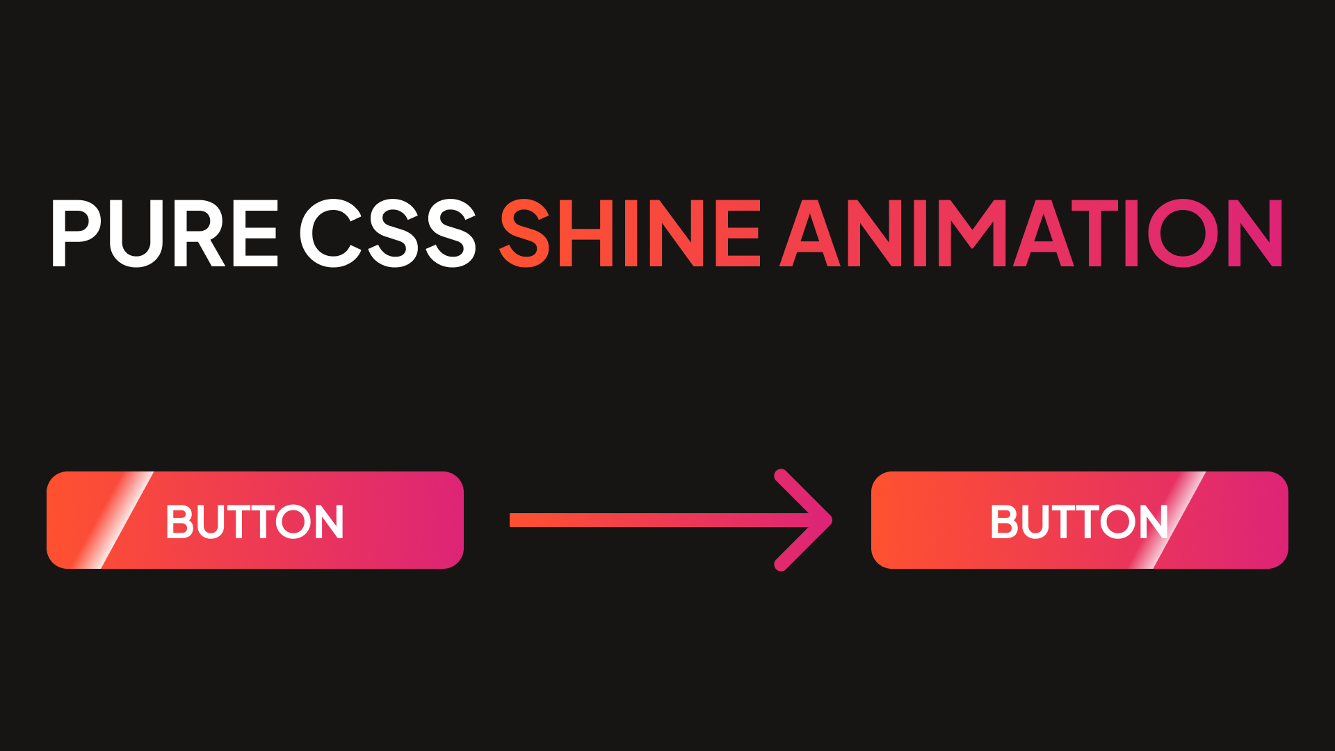
Hi everyone, welcome to my website. In this quick and easy tutorial, I'll show you how to create a shine animation for any element of your website, using only pure HTML and CSS, no scripts needed. In the article, I'll implement animation for a button, but you can apply this to almost any element on your website.
If you want just to copy and paste the code, or to experiment with it, here is a codepen I created with this feature.
Creating CSS shine animation effect
First things first, let's create an element, to which we will add our shine animation. In my case, I'll create a link, that will play a role of button.
<a href="#" class="button">Button</a>Next lets add some styles, to make button looks more fancy.
.button {
  padding: 20px 80px;
  background: linear-gradient(
    90deg,
    #ff5e69 44.79%,
    #ff8a56 71.87%,
    #ffa84b 99.99%
  );
  color: #ffffff;
  text-decoration: none;
  font-size: 24px;
  font-weight: 600;
  border-radius: 10px;
  position: relative; // relative position is important to place shine properly
  overflow-x: hidden; // overflow is important, to hide animation outside the button
}
From CSS code above, it's important to add overflow and position properties. Position will help to place animation properly, and overflow will hide animation outside the button.
Finally, let's add our "shine" and an animation for it. I'll make "shine" from pseudo-element (::before in this case)
.button::before {
  content: '';
  position: absolute;
  top: 0;
  height: 100%;
  width: 45px;
  transform: skewX(-45deg);
  left: -150%;
  background: linear-gradient(
    90deg,
    rgba(255, 255, 255, 0.2),
    rgba(255, 255, 255, 0.6)
  );
  animation: shineAnimation 3s infinite linear;
}

@keyframes shineAnimation {
  0% {
    left: -150%;
  }
  100% {
    left: 150%;
  }
}
That's all. You can play with pseudo-element and animation to configure effect like you want. Here is a result.

