Web Development Tutorials
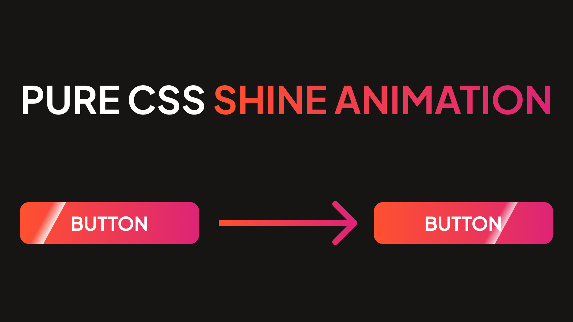
Pure css shine animation
In this simple and easy tutorial, I'm gonna to show you how to create a shine effect for any website element using CSS. Shine animation can create accent for an element. It looks good on buttons. We will be using only pure CSS and HTML, no scripts needed.
25.09.2024
186 views
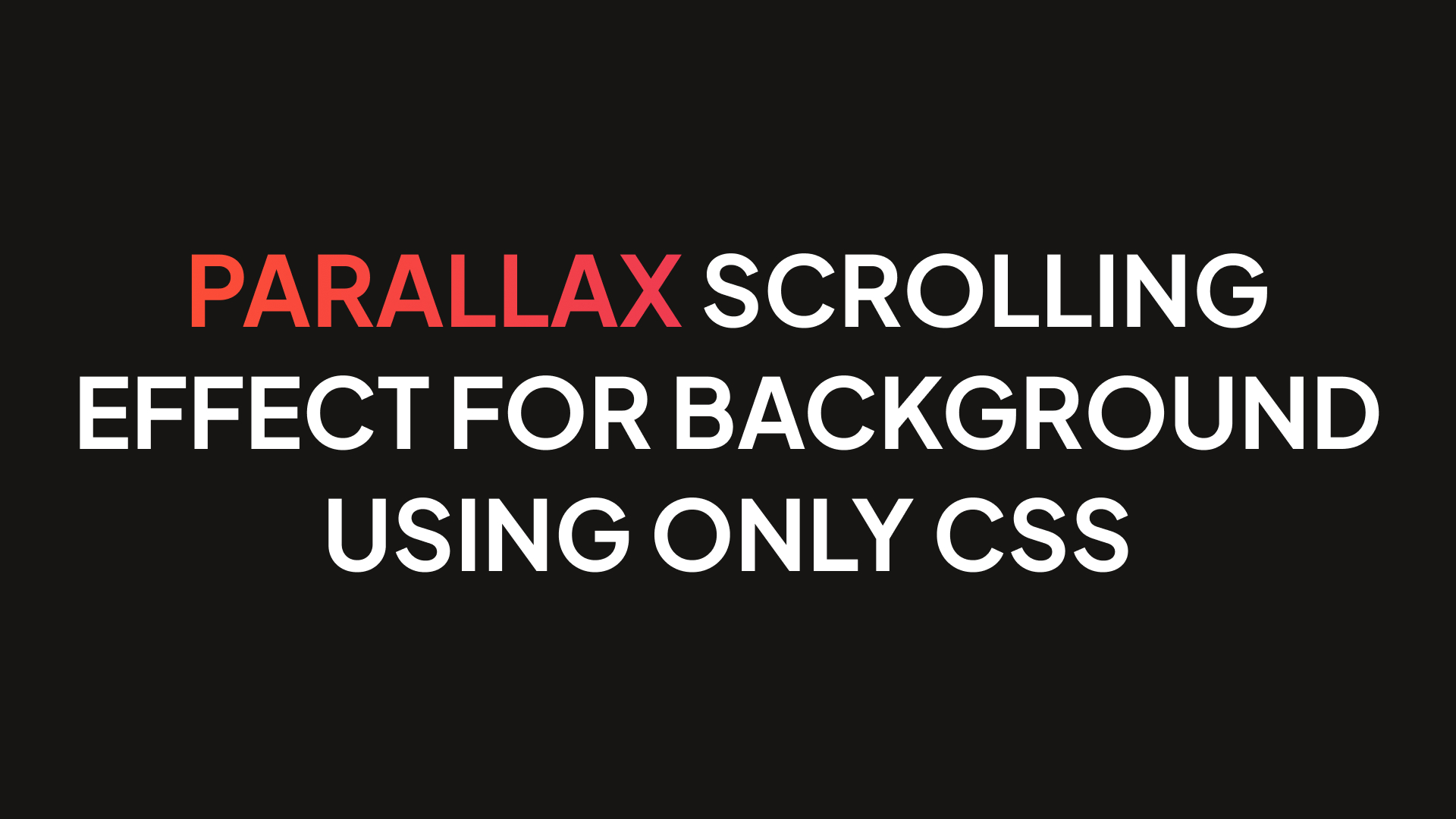
Parallax scrolling effect for background using only CSS
In this short article, I'll show you how to create parallax scrolling effect for background. You can apply parallax CSS effect from this instruction to any element on your website. Also, we'll not be using any libraries or JavaScript, only pure CSS and HTML.
18.04.2024
59 views
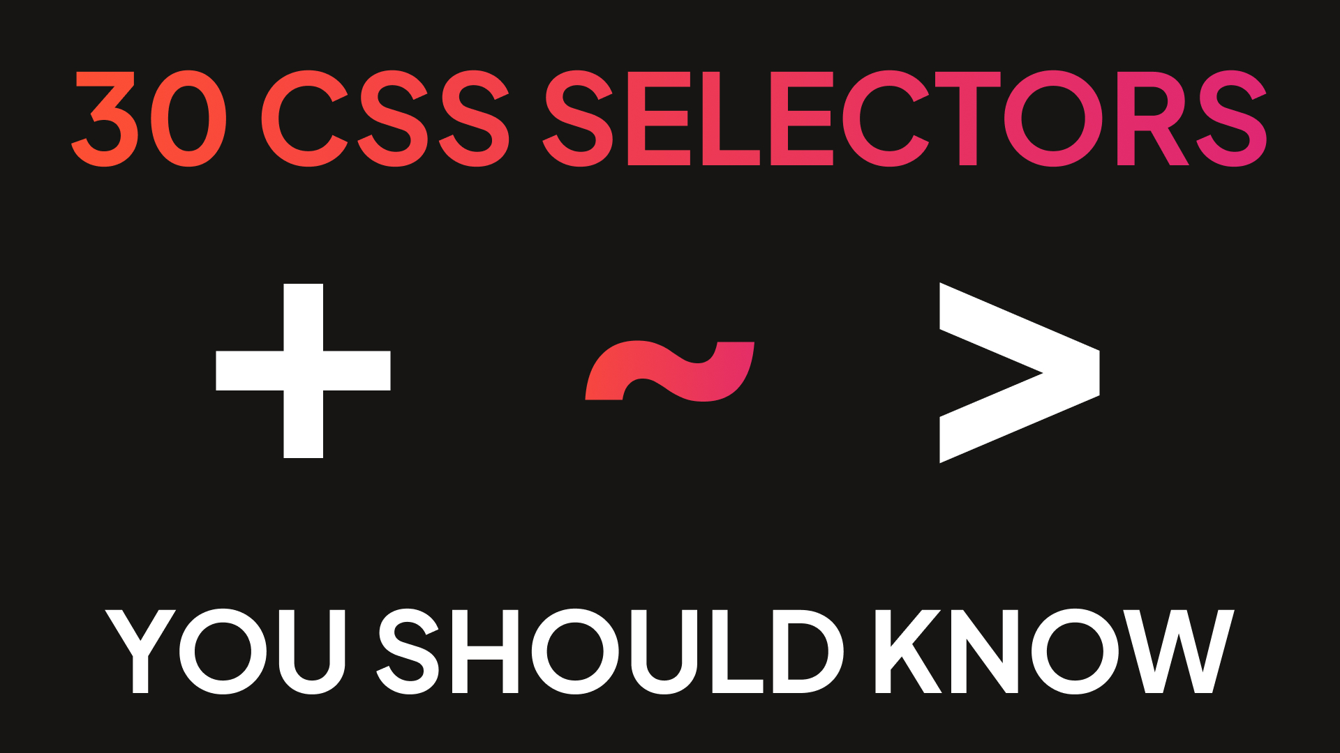
25+ CSS selectors you should know in 2024
In this article, I'll show you 30 CSS selectors every frontend developer should know in 2024. From basic like element, and ID to more complex CSS selectors.
18.04.2024
10 views
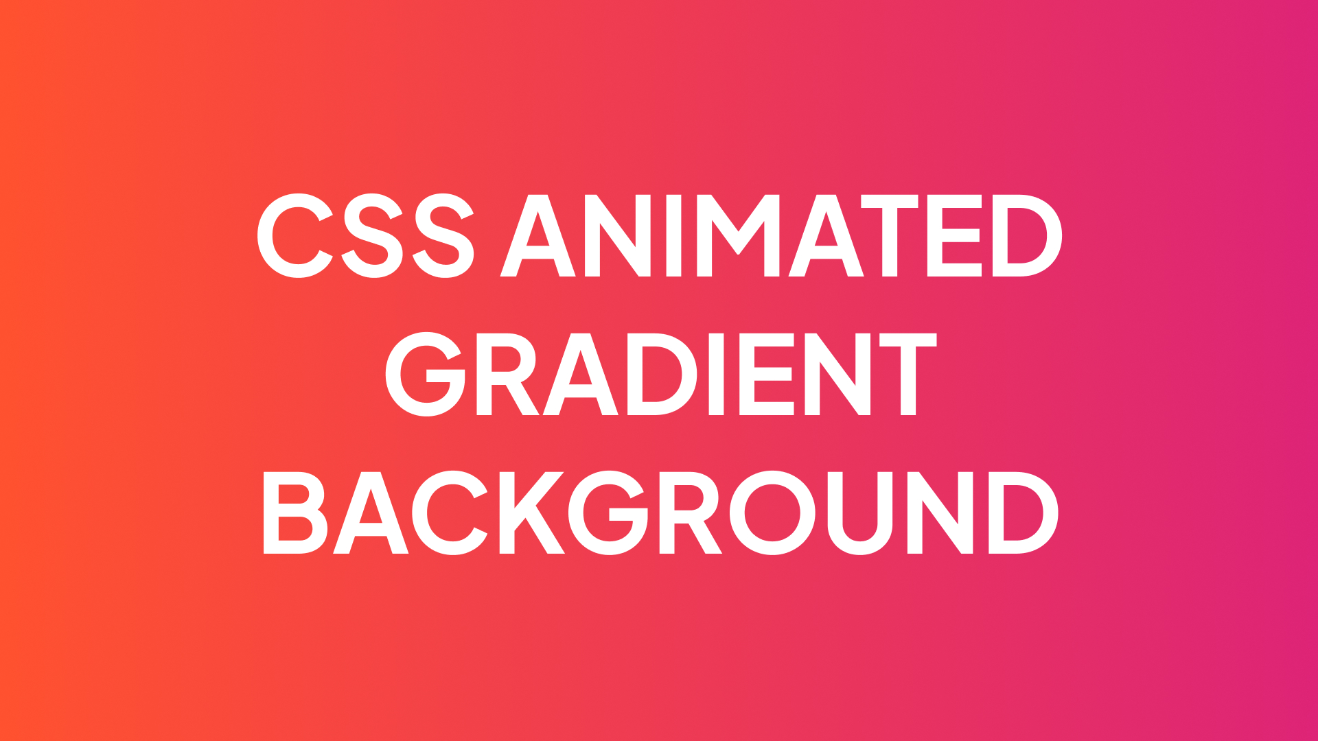
CSS animated gradient for background
In this short tutorial, I'll show you how to create an animated gradient background using pure CSS. You can apply this CSS animated gradient for any element on your website.
12.04.2024
70 views
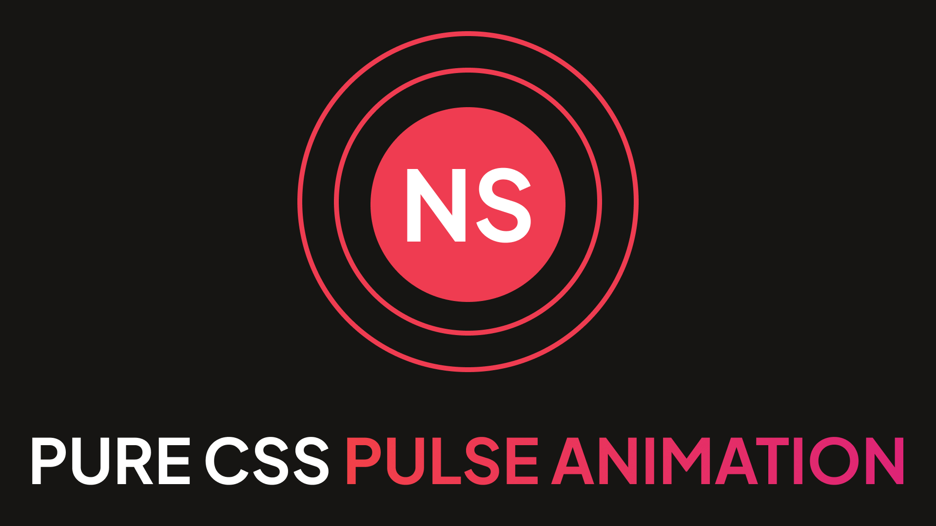
Pure CSS pulse animation
In this short tutorial, I'm gonna to show you how to create a pulse effect for any website element using CSS. Pulse animation can create accent for an element. We will be using only pure CSS and HTML for it, no JavaScript knowledge needed.
08.04.2024
387 views